|
|
Post by ✶April✶ on Sept 9, 2015 17:57:59 GMT -5
(I posted this at my forum but I figured there's a better chance of getting responses here)So lately, I have been kind of experimenting with the idea of how exactly ebooks are created. I have an ongoing novel that I've been working on for years and I've been able to use that as an example (though it's highly unfinished, but still) and of course what do all books have? A book cover. And whether someone reads a book or not is usually based on how appealing the cover is. So I've been toying around in Photoshop with making this: 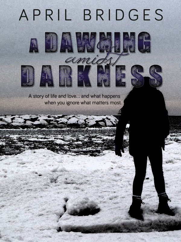 It's what I would imagine the book cover would look like for my book, if it ever got published. The text is all authentic, nothing made up for the purpose of an example. I just wanted to see if I could get some opinions from you guys because I have never designed a book cover before and I'm not gonna lie, there were several previous attempts. Here's what I did... I took a photo that I'd taken out at Lake Erie in Pennsylvania, and the figure in the photo is actually my boyfriend's daughter, tweaked to look like a silhouette. Then I added the text. What do you all think? Does it look "professional" or is it still a bit amateur-ish? If you saw this in a bookstore, would it be enough to make you want to pick it up and read it? (Be honest, it won't hurt my feelings  )
|
|
|
|
Post by endo on Sept 9, 2015 22:00:21 GMT -5
I'm no artist, but I think it looks great!
|
|
|
|
Post by ✶April✶ on Sept 10, 2015 10:45:13 GMT -5
Thanks endo!  And it's perfectly fine that you're not an artist, that's actually better in some ways.  |
|
|
|
Post by Rictras Shard on Sept 10, 2015 20:28:00 GMT -5
The shadowy figure would intrigue me, and I would look at the back cover to see the description of the story.
I am unsure of the empty snowfield on the left. It can inspire feelings of isolation and loneliness, so if that is what you are going for, it works nicely. If you have another strong theme in the book that doesn't involve the figure, you may want to find a way to represent it in that space.
All in all, job well done.
|
|
|
|
Post by james on Sept 11, 2015 9:10:30 GMT -5
I like it. Not CRAZY about the fonts, and I think layout-wise it might work better if the title didn't "interfere" with the silhouette, but I definitely dig it. Very well done. I've seen professional covers that are much, much worse . . . so you're already ahead of the pack. |
|
|
|
Post by ✶April✶ on Sept 11, 2015 11:48:35 GMT -5
The shadowy figure would intrigue me, and I would look at the back cover to see the description of the story. I am unsure of the empty snowfield on the left. It can inspire feelings of isolation and loneliness, so if that is what you are going for, it works nicely. If you have another strong theme in the book that doesn't involve the figure, you may want to find a way to represent it in that space. All in all, job well done. Those feelings become more of a theme in the second half of the book so I'm happy that that was what the image inspired for you. It's there in the first half as well, but in a more subtle way. I still have to re-write the majority of the first half though, so once I get that done, I'll have to see if I need to re-adjust how the image depicts the story as a whole. Thanks so much, I really appreciate your feedback!  I like it. Not CRAZY about the fonts, and I think layout-wise it might work better if the title didn't "interfere" with the silhouette, but I definitely dig it. Very well done. I've seen professional covers that are much, much worse . . . so you're already ahead of the pack. Aw, first off, thanks so much! Coming from the resident author, that means a lot to me! I kind of liked the interference of the silhouette with the "Darkness" title though... and trust me, I did try it without the two connecting and it seemed like something was off. I felt like if they were connecting, it would draw the viewer's eye to the figure and the silhouette effect would have more of an impact. But I do see what you're saying... maybe if I moved it slightly down so that the title is only slightly touching the top of the head, it would look better. Just curious, what do you not like about the fonts? Are they difficult to read with the effects I used? Or you just don't like the style? |
|
|
|
Post by james on Sept 11, 2015 15:14:59 GMT -5
Ya know what? Forget what I said. The more I look at it, the more I like it as is. You're absolutely right, re: your reasons for the title touching the character's head.
Good stuff!
|
|
|
|
Post by ✶April✶ on Sept 11, 2015 17:07:39 GMT -5
Hah, well then, thank you again! |
|


 )
)